.jpg)
Color


Objective: This is our last project for this class which is again a three-part project (however it's not that bad since we are only required to do three small 5" x 5" compositions). For this project, we are to pick out a simple yet dynamic and interesting (as always) composition that will be rendered in three different coloring styles/principles: complementary, analogous, and monochromatic. The purpose of this project is to test us on our coloring techniques and also to help show how colors can really help bring dynamic to even the simplest design.
Progress: This was probably one of the easiest projects that was assigned to us since forever. Nevertheless, coloring still takes time and good arts always take time. (sad facts of life...)
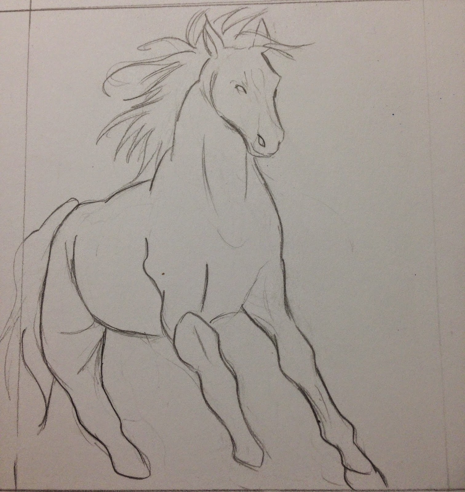
Initially, I wanted to do a horse because I wanted to be uniquely complicated for no real reason /nobigdeal
But you should know by now that I am too horribly lazy pro at this point to not realize that I should not go with something as boring as a horse. Nevertheless, I'm still gonna share with you the sketch that I did with it :P
Then so I decided to go with birds instead. I searched for close-up pictures of birds on Google and found this awesome picture of an eagle's eye:
I didn't really copied it down exactly the same. Kinda put my own twist into it to make it a bit more interesting and much creepier as you can see lol
Anyway, here are some sketches I did with this project:
So first of all, we had mainly three options for the complementary coloring: Red-Green, Violet-Yellow, and Blue-Orange. To be honest, I have always thought of blue and orange as a weird color combination so I didn't think that I would actually be using it. However when I sketched out all three combinations, the blue-orange stood out the most so I decided to go with it.
As for the analogous, I wanted to do red, red-orange, orange, and yellow at first (yes, I'm a warm colors person :3) but even before I tried it out, I thought it would not turn out as bold as I would like it to be so I switched to using violet, red-violet, red, and red-orange instead. It turned out surprisingly nice when I sketched it out so I decided to seal the deal with this combination. I later on did try out the first combination I thought up as you can see at the bottom left but the sharp dynamic and vibrancy was not there as with the second combination. So I did make the right choice going with what I went with for the first time.
Then finally the monochromatic one is where we can only use one color with the help of tints and shades. I was pondering between green and yellow because I wanted to do this composition with a color I haven't used yet. I decided to go with green since it fits along with the other two compositions better being of darker value as they are (and also because I'm a Pokemon fan and since you have fire and water already, the last will need to be grass)
 |
| The Pokemon Pride! |
Thoughts and Feelings: I think this project went pretty well. All three came out nicely albeit creepy (especially that green one & it didn't help that I accidentally made the pupil much smaller for it as well :))). My personal favorite is the analogous one. I just really love the intensity that I'm getting out of it /blush
The one problem that I have though is that I should have rendered the hair for that one more like the other two since it looks a bit cartoonish because of it.
So yeah, this is the very last post :( You're still welcome to share your thoughts and feelings though!
It has been fun making this blog (although it is a bit stressful since this is for Final ~.~)
Thank you for stalking visiting this place and I hope you have enjoyed your stay :)
P/s: I'm so glad I'm done with this class!

Anyway, God bless and see ya! /bye
No comments:
Post a Comment